
I love these kind of visualizations. How helpful are they? I'm not sure, but they do provide a big picture perspective of relationships between the biblical texts. I'm pulling this from this thread on Twitter.
The first is by Cody Kingham who writes:
 Also in that Twitter thread, Camil Staps writes:

The first is by Cody Kingham who writes:
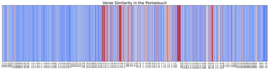
Formulaic Language in the Pentateuch
In reading through the Pentateuch, I've noticed that several sections contain a lot of repetition. This formulaic language seems to serve as a way of organizing and carefully structuring segments of text. In this notebook, we will visualize this phenomenon in the Pentateuch with a heatmap. A heatmap is a graph which visualizes integers as "temperatures". The lower a value, the "cooler" it is, and vice versa. The colors blue and red are used to represent cold and hot values.
Here is a similar project of mine: on the internet, which verses are frequently mentioned together? There's quite some noise, but nevertheless you can see the popularity of Gen 1-11, Ps & Isa, vs. e.g. Est & Lam. Also note the synoptic parallels in Kgs/Chr and Mt/Mk/Lk!
The darker red square in the lower right is the NT. In the upper left of that square is a slightly darker red that indicates relationship between the Gospels.
Thanks to Kingham and Staps for sharing these!


No comments:
Post a Comment